UX/UI Case Study
Jones Road:
Homepage Redesign
Homepage Redesign
Project Overview
As part of a UX/UI design challenge, I was tasked with redesigning the homepage of the Jones Road Beauty website. The goal was to improve visual hierarchy, loading performance, mobile experience, and conversion clarity — without changing the brand’s tone or aesthetics.
INTERACTIVE PROTOTYPE / FULL FIGMA FILE
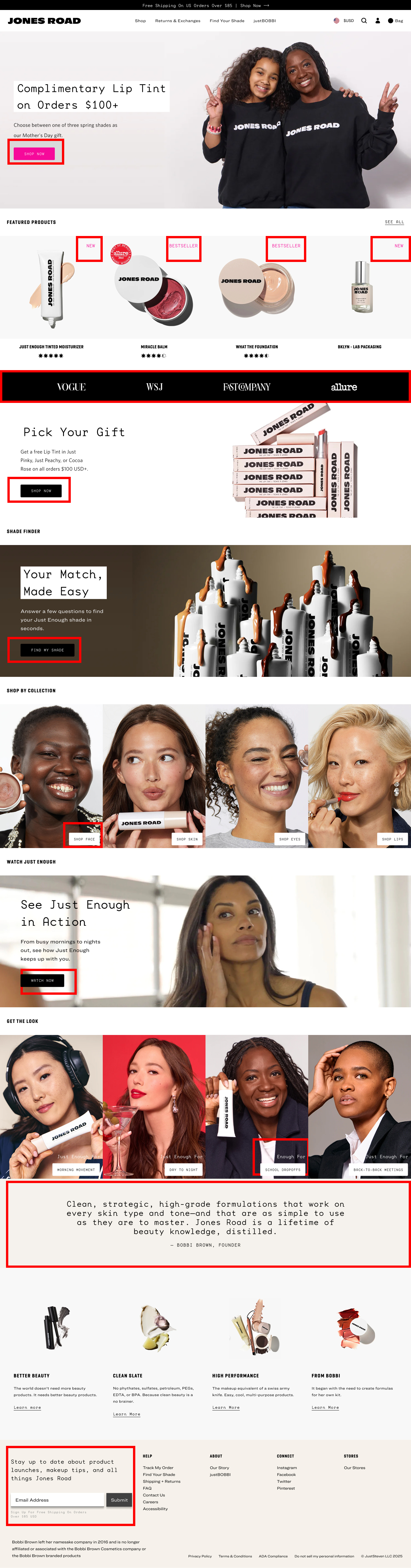
Problem
The original homepage had:
• Poor visual hierarchy making it hard to scan.
• Weak CTA placement (small buttons, inconsistent visibility).Redundant sections leading to longer load times.Accessibility issues: low contrast, small text sizes (<16px), and dense content.
• Inconsistent brand storytelling spread across too many blocks.
I ran the homepage through accessibility checkers (Stark / WebAIM), which flagged:
• Low contrast in CTA buttons and quote section.
• Body text below accessibility recommendations (16px).
• Insufficient spacing between blocks, harming readability.
Redesign Goals
1. Improve Visual Hierarchy
- Reorganize layout to make it easier to scan.
- Ensure the most important content (e.g. CTAs, products) appears earlier.
2. Increase Conversion RateStronger
- CTAs with better placement and sizing.
- Clear value propositions (gift offer, video guide, quote/testimonial).
3. Improve Accessibility
- Increase body text to 16px+.
- Use better contrast (text/background, buttons).
- Use a consistent 6px spacing system for breathing room.
4. Enhance Mobile Usability
- Prioritize tap targets, scrolling, and content flow.
- Restructure layout for fast product access on mobile.
5. Reduce Bounce Rate
- Move CTA and key info above the fold.
- Simplify navigation and reduce friction early on.
6. Improve Page Load Speed (Option B focus)
- Remove non-essential sections (video, quote).
- Minimize DOM size and visual noise.
7. Establish Brand Trust & Credibility
- Add quote/testimonial with founder name and story.
- Showcase diverse faces in imagery for authenticity.
- Use consistent branding (font, product visuals, tone).
8. Align with Modern E-Commerce Patterns
- Move featured products directly under hero image.
- Mimic user expectations from other beauty brands (Glossier, Sephora).
9. Unify Typography and Button Styles
- Consistent sizing, weight, contrast across text and buttons.
- Unified button styles to reduce confusion.
10. Create a Polished, Conversion-Centered Experience (Option A focus)
- Keep all value-building sections (video, quote, gift) for users who want full brand storytelling.
- Ideal for luxury or higher-trust e-commerce.
11. Support A/B Testing Strategy
- Offer Option A as the high-engagement version.
- Offer Option B as the performance-optimized control.
TWo Redesign Variations
Option A – Enhanced User Experience
This version uses all original sections but reorganizes layout for stronger usability and emotional connection.
• Key Improvements:
- Clearer structure & 6px spacing system.
- Better CTA visibility and placement (mobile & desktop).
- Larger, readable typography.
- Highlighted value sections: quote, video, gift offer.
- Stronger brand storytelling and trust signals.
• Results Focus:
- Higher Conversion Rate: Stronger CTAs + emotional triggers.
- Better Accessibility: All text ≥16px, contrast improved, spacing adjusted.
- Increased Brand Trust: Founder quote, video and testimonials placed higher.
-Lower Bounce Rate: Engaging hero and content flow keeps user interest.
Option B – Streamlined Control Version
A/B variant closer to the original site, but simplified.
• Key Improvements:
- Removed video, gift, and quote sections.
- Featured products moved higher.
- Focused on fast-loading experience.
- CTAs made stronger and consistent.
• Results Focus:Improved Speed & Focus:
- Fewer distractions.
- Improved Accessibility: Same text/contrast upgrades.
- Maintains Brand Consistency: Familiar layout, less risk.
- Lower Bounce Rate: Direct product access faster on mobile.
Screenshots
Include in this order:
Original site: full desktop and mobile screenshots (highlight worst areas).
Option A: desktop & mobile, full scroll + close-ups (CTAs, quote block, etc.)
Option B: same, side-by-side view to contrast structure and hierarchy.
Reflection
This project pushed me to focus on small but high-impact UX decisions, such as improving accessibility and mobile flow. It reinforced how subtle layout shifts can clarify user intent and improve performance — especially in fast-paced e-commerce contexts.
Before & After: Mobile Optimization
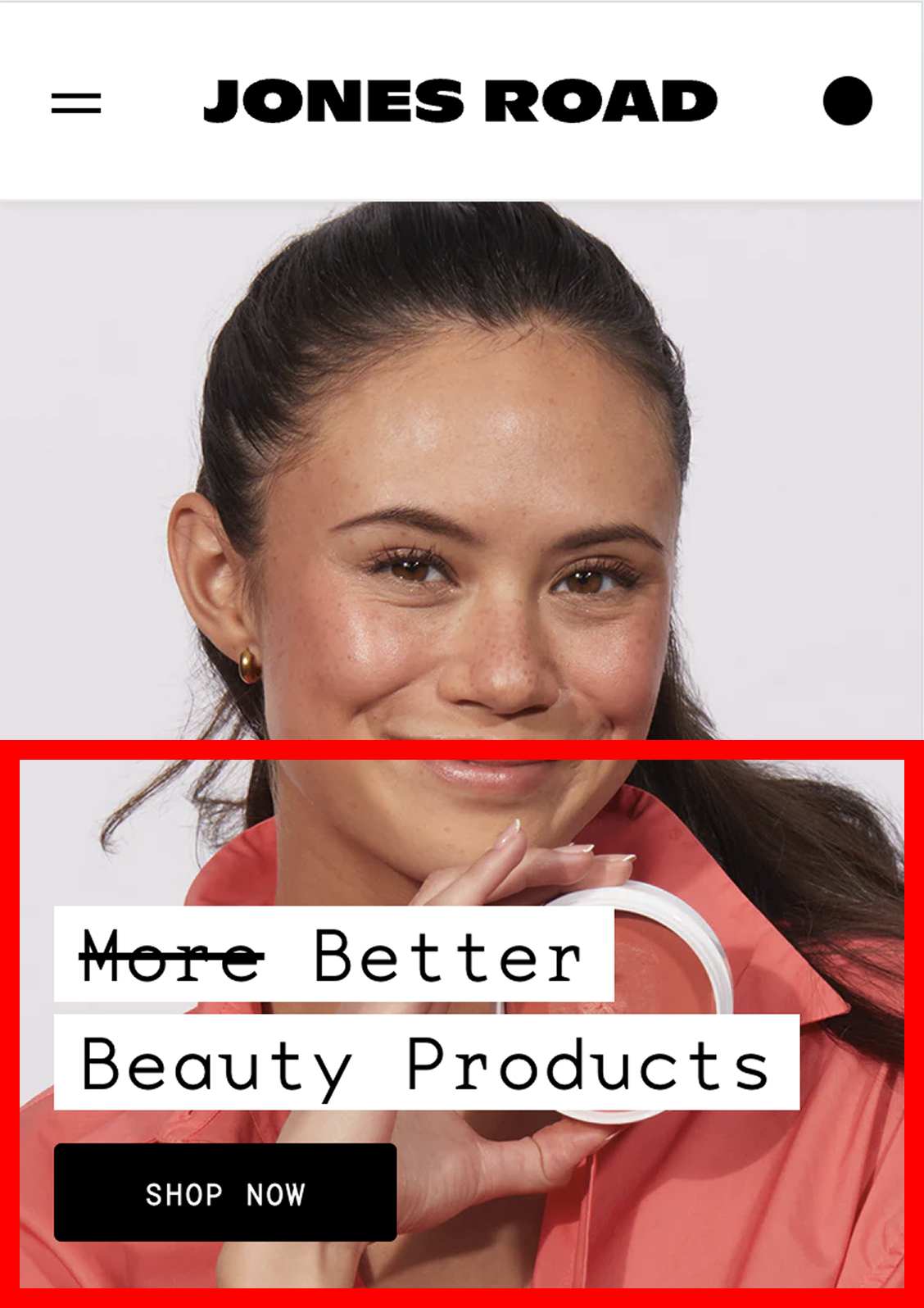
The CTA button (“Shop Now”) lacks size and contrast, reducing visibility.
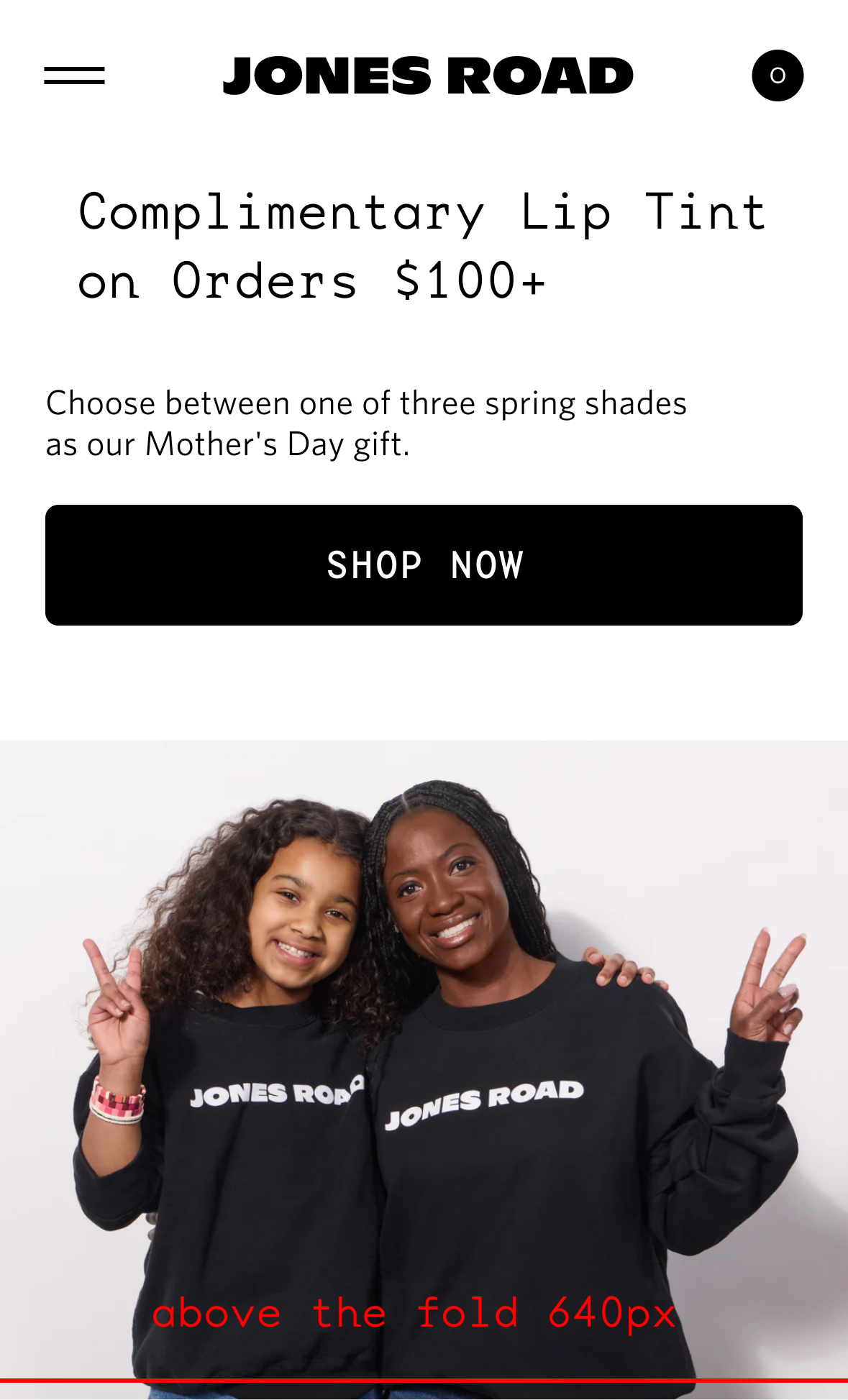
CTA button is larger, more prominent, and uses strong contrast for clarity.
Overcrowded layout, inconsistent badges, small text, and cluttered pricing make scanning hard. CTAs are too close and lack focus.
Clean carousel view with clear spacing, readable text, and focused CTAs. Better hierarchy and mobile usability.
mages are cropped awkwardly, limiting visual impact. Category labels are inconsistent and hard to scan. Poor hierarchy makes it unclear what to click.
Clear category separation, full visuals improve appeal. Buttons are well placed and readable, with better structure and tap targets.
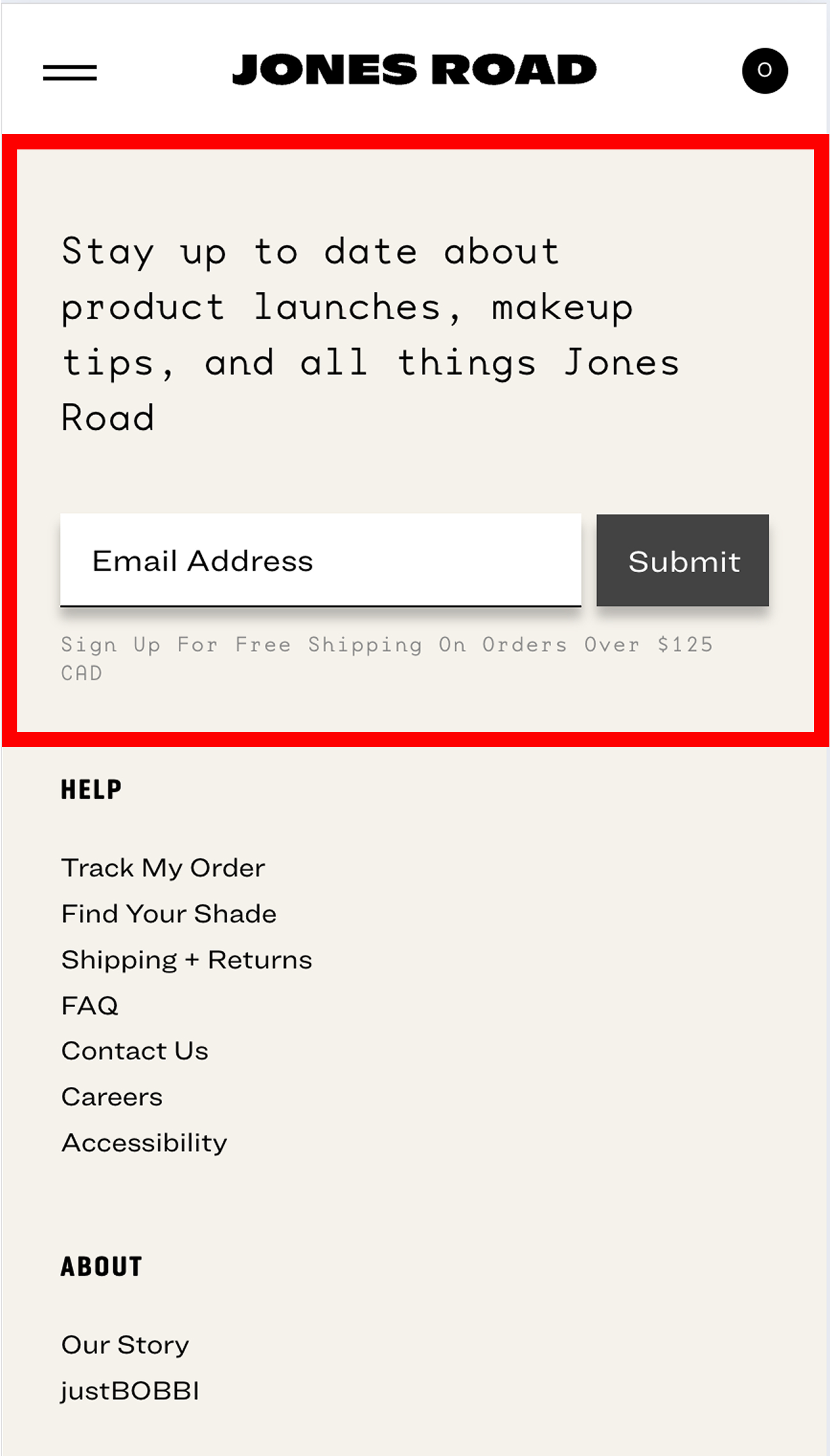
The “Submit” button feels cold, and the hard shadow looks outdated. The free shipping message ($125 CAD) is low contrast and hard to read, reducing clarity and effectiveness.
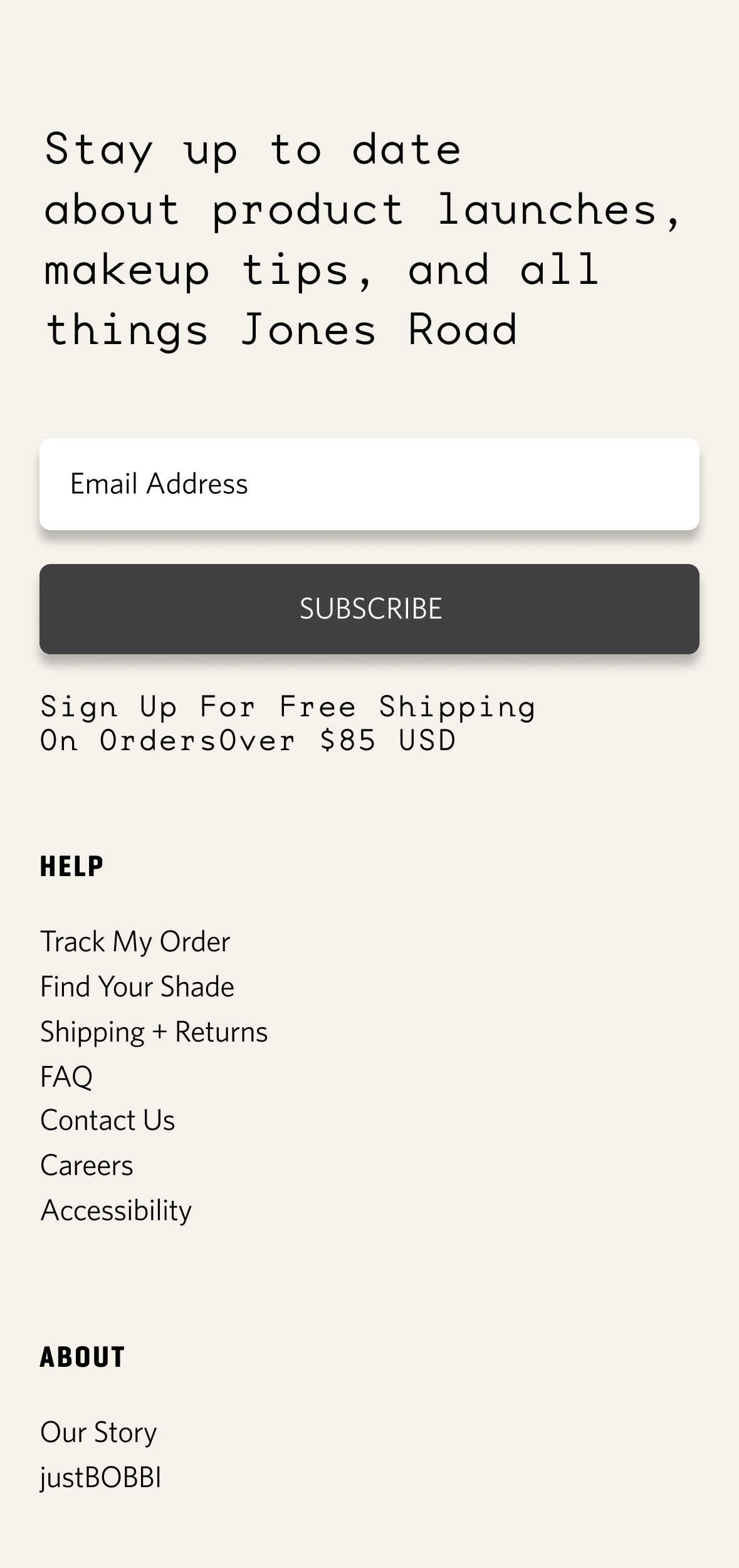
The button now says “Subscribe,” which feels more welcoming. Layout spacing is cleaner, and the free shipping text ($85 USD) has better contrast, improving readability.
Before & After: Desktop Optimization
The pink CTA has poor contrast and a thin font, making it hard to read. Layout feels cramped, with text and button too close together, reducing visual clarity.
The black CTA offers strong contrast and clear typography. Improved spacing gives the content room to breathe, making the layout more readable and visually balanced.
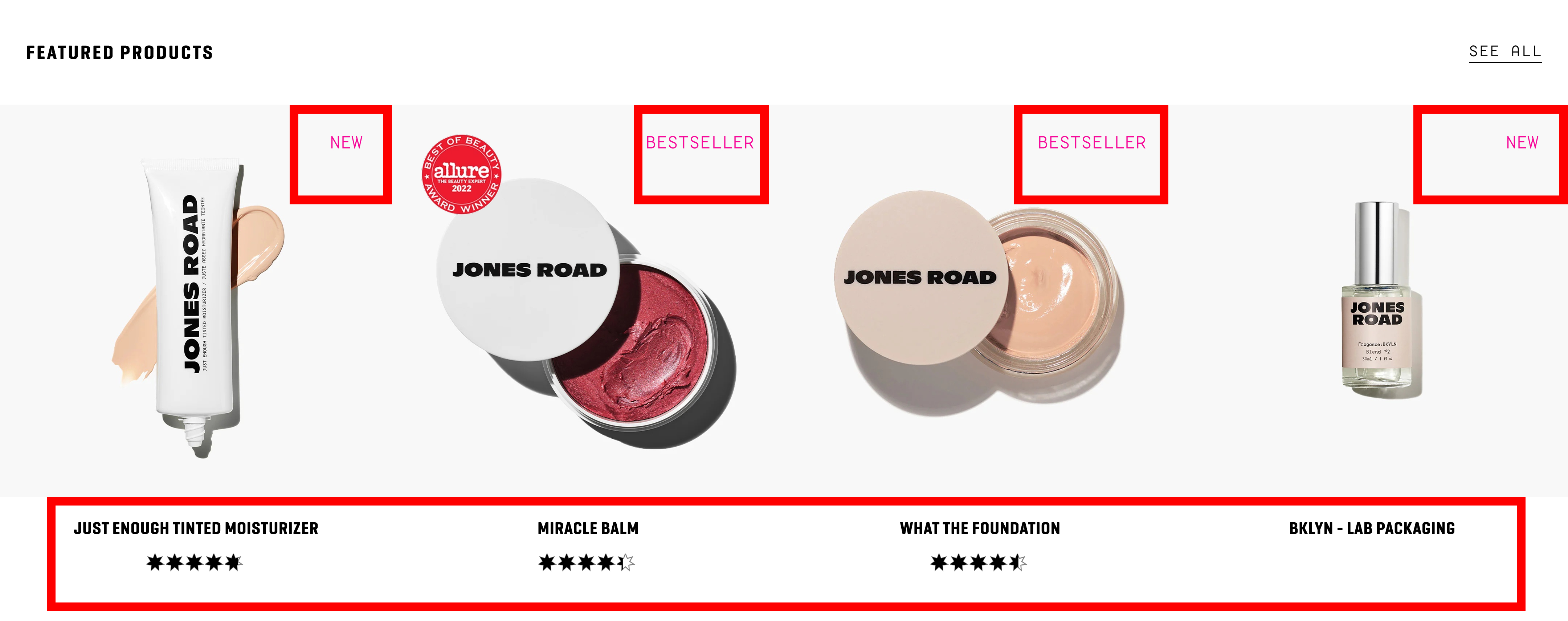
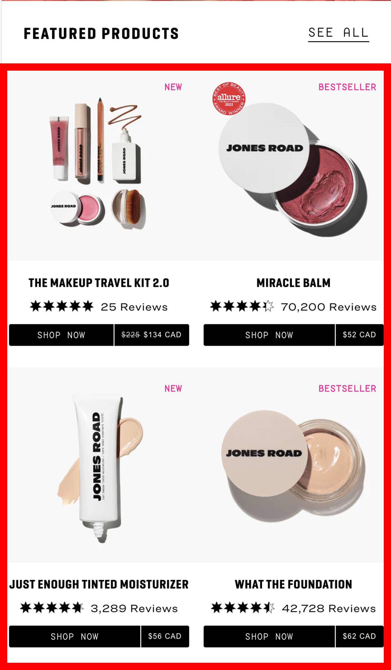
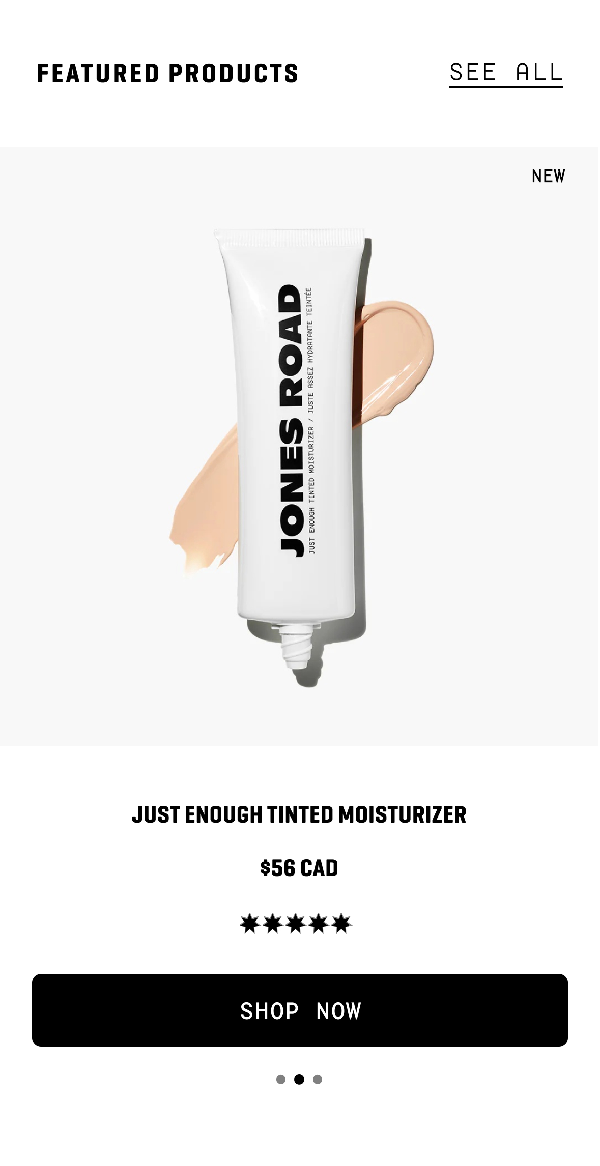
The price is completely hidden, forcing users to click into the product page just to see it — a frustrating experience. The “NEW” and “BESTSELLER” tags are in low-contrast pink, making them hard to notice.
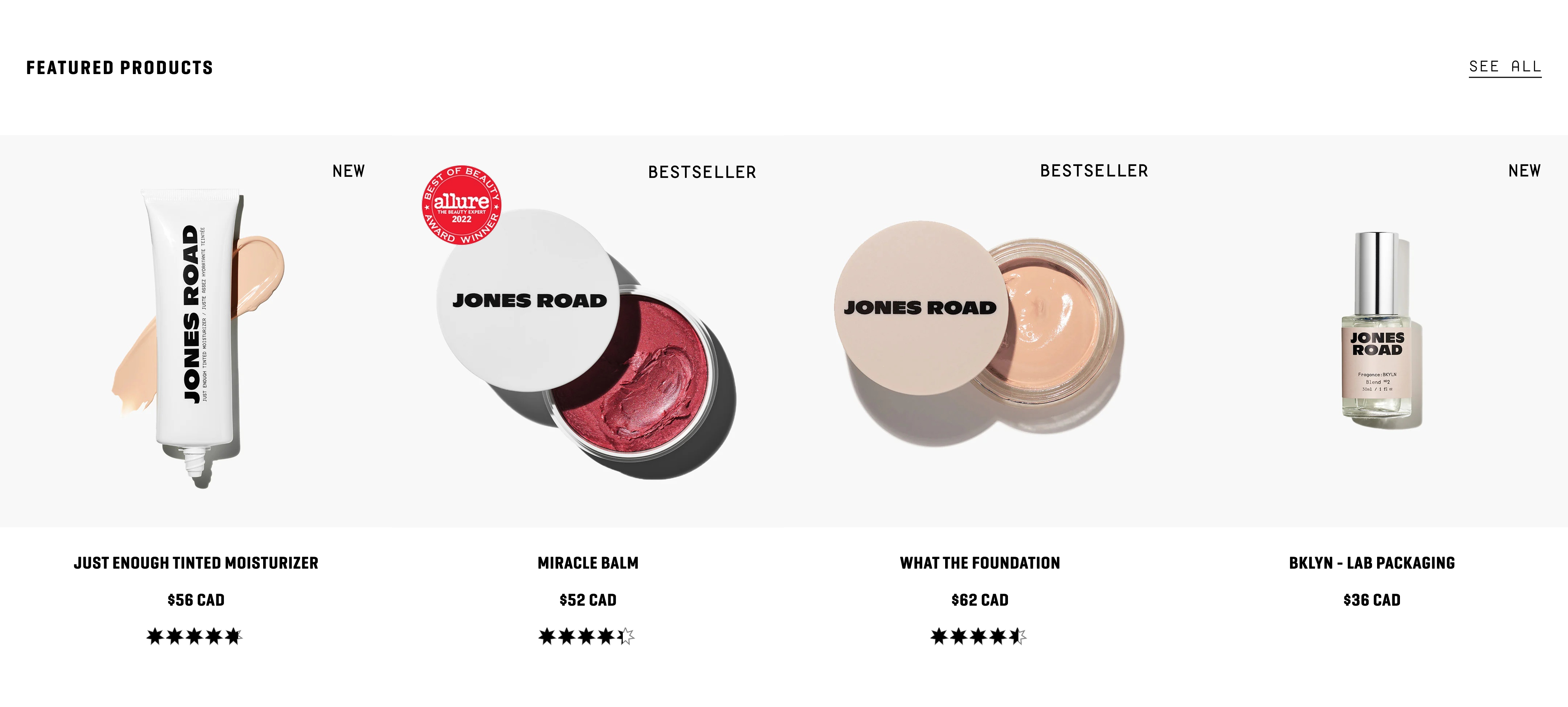
Prices are immediately visible, improving usability and building user trust. The layout feels cleaner and more structured, with improved spacing and alignment. Tags are easier to read, and overall readability is way better.

Text and CTA are hard to read due to low contrast and light font weight, especially on bright backgrounds. This reduces accessibility and visual clarity.
Stronger contrast and bolder typography improve text visibility. Layout feels more polished and accessible, ensuring CTAs stand out clearly across all images.

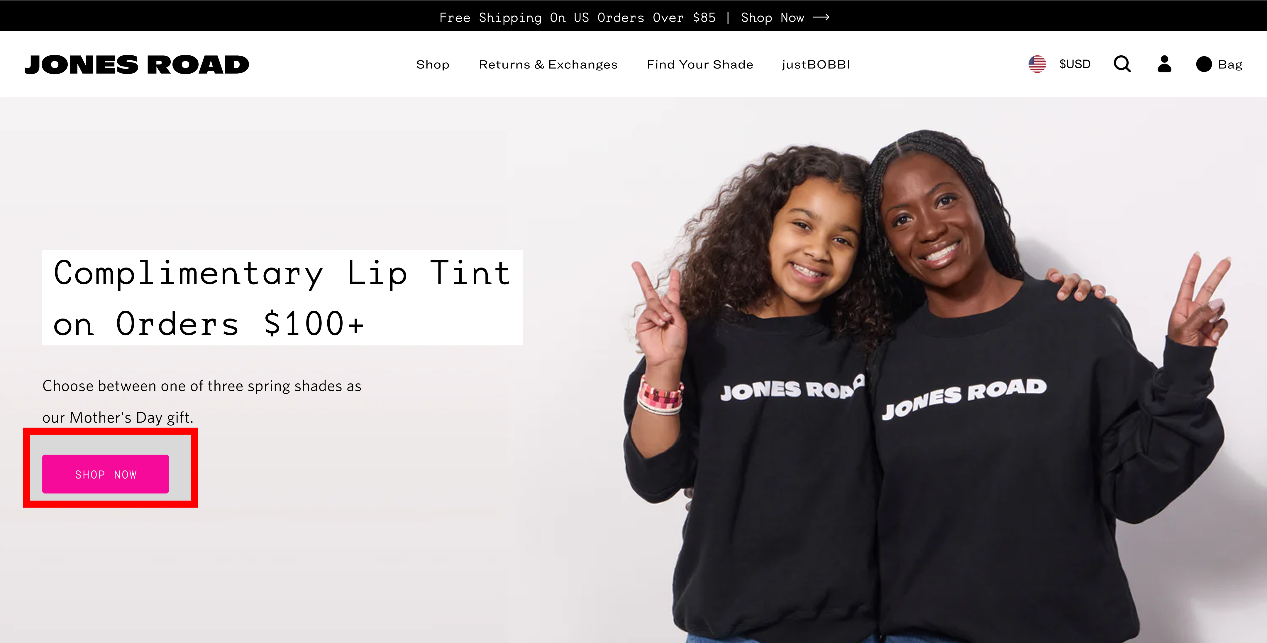
The newsletter form feels cramped in the corner and lacks visual hierarchy. The small “Submit” button is not clearly styled as a CTA, and the section competes with nearby footer links, reducing clarity and emphasis.
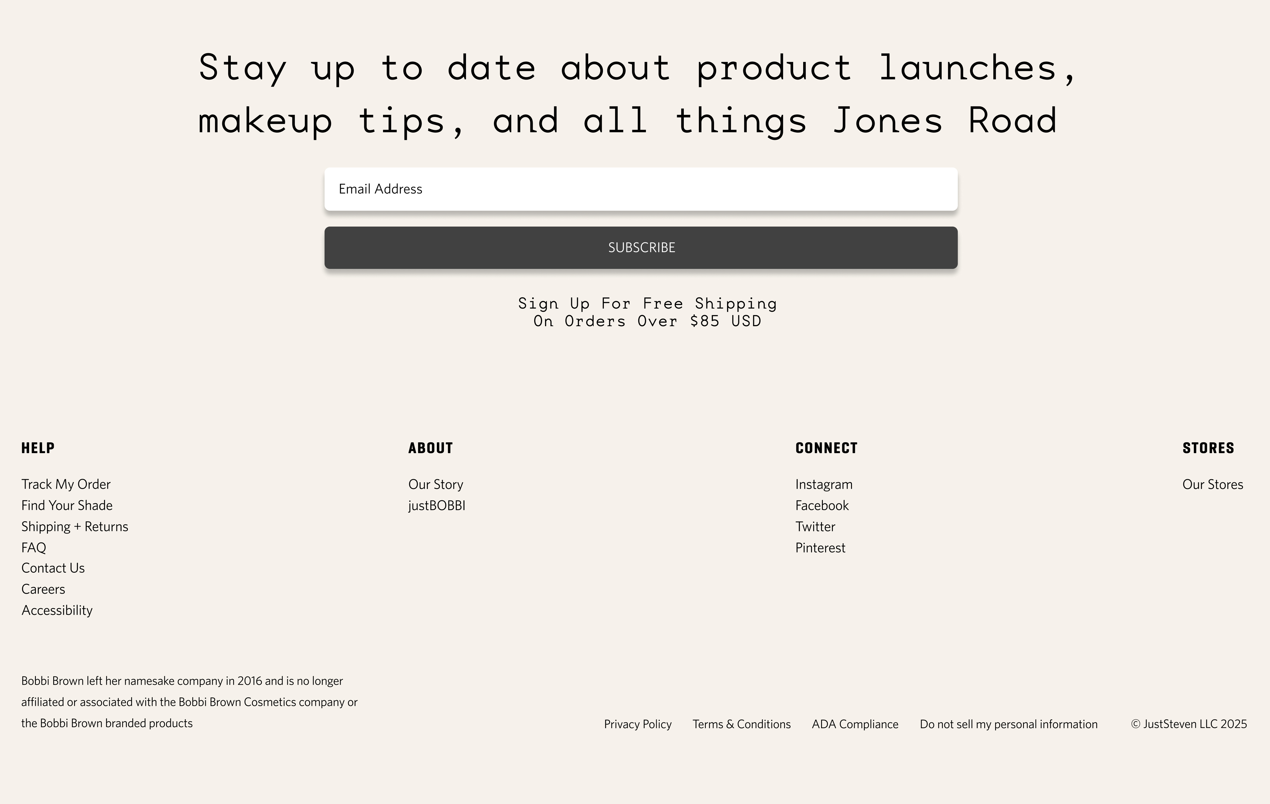
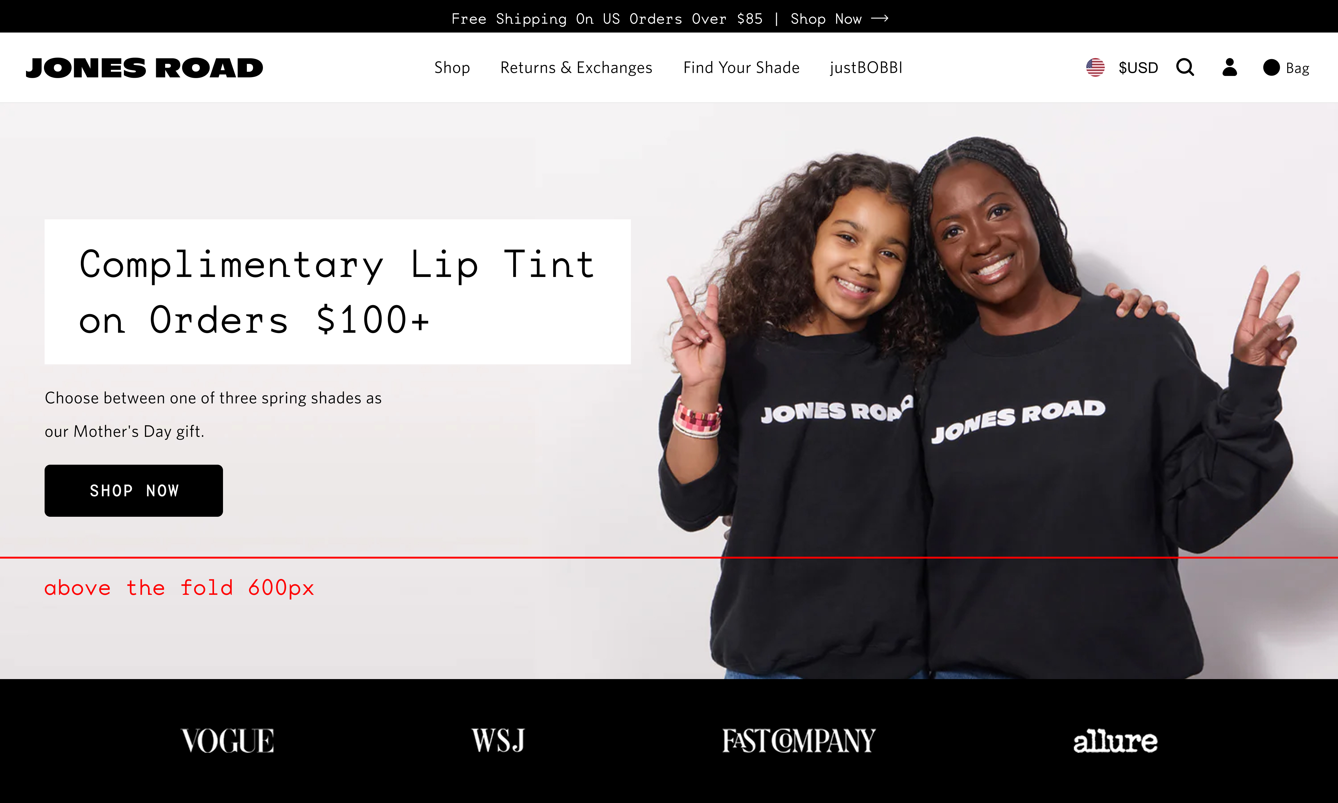
The newsletter form is centered with generous spacing, giving it stronger visual priority. The large “Subscribe” CTA is easy to find and read, improving usability. Overall, the layout feels more structured and user-friendly.
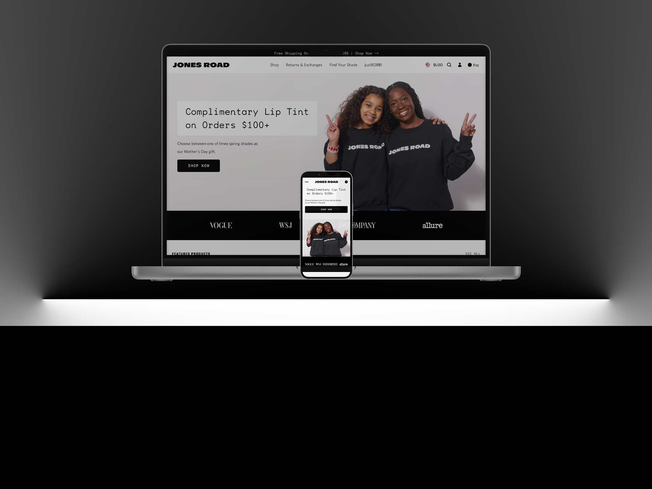
Original version (Desktop vs Mobile)
This is some text inside of a div block.

Redesign Option A (Desktop vs Mobile)
.jpg)
This is some text inside of a div block.
.jpg)
Redesign Option B (Desktop vs Mobile)
.jpg)
This is some text inside of a div block.
.jpg)